Dispatch
Digital Zine


The first printed edition of Dispatch is an absurd take on an innocent observation: “We are producing a piece of paper for Crane Brothers, so why not invite our customers to fold Dispatch into a paper crane?”
This simple wordplay allows a world of creative expression, tapping into the rich semiotics of the origami crane (a symbol of prosperity and longevity) as Crane Brothers looks towards its next 25 years in business.
With every mindful fold, it embodies the patience, precision, and attention to detail that Crane Brothers cultivates.
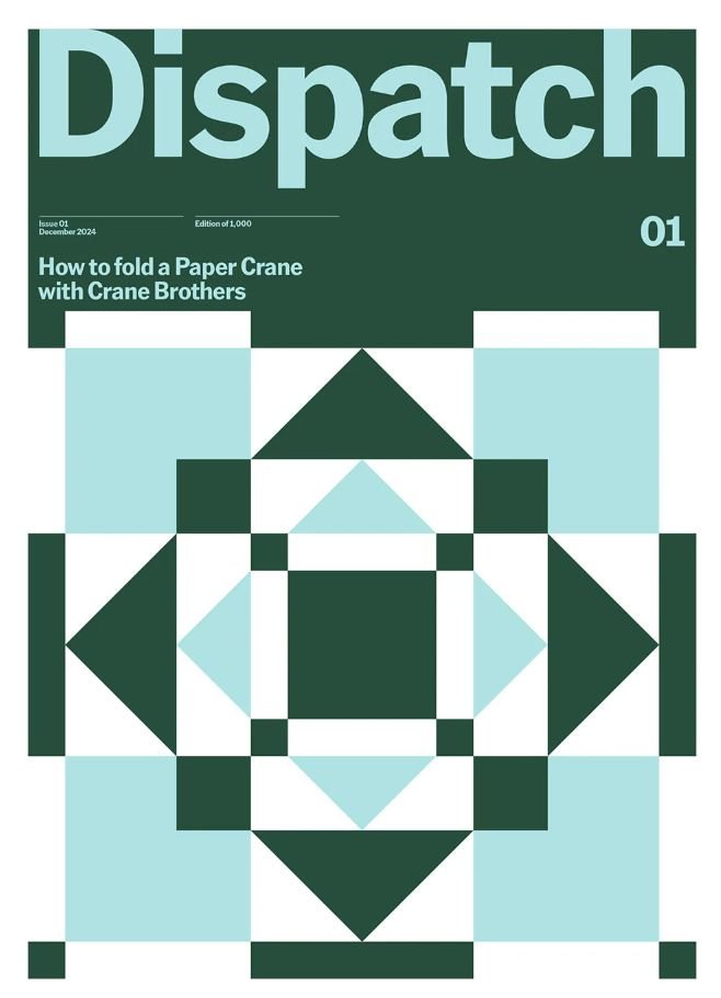
The broadsheet printed newspaper is the key media component and is designed to fit on a large paper sheet, offset printed in two spot colours. A graphic origami pattern takes advantage of the unique geometry and folding template of the crane, to channel the founder’s love of modernist design icons such as Annie & Joseph Albers. The resulting kaleidoscopic pattern can be trimmed into an origami square of numerous sizes, producing a family of unique cranes. American Grotesk by Klim Type Foundry, with its workhorse roots in Franklin Gothic and Trade Gothic, brings an industrial, upfront tone that subverts the playful sentimentality of the subject matter.